Graphs and Charts in Excel
Excel Charts or Graphs are the most important feature of Excel. If we had only tables full with numbers, nobody would be interested in these unreadable things.
So here is how to easily add a graph or chart to your worksheet.
Once you have a table with numbers in it......you can create a graph of it !!!!
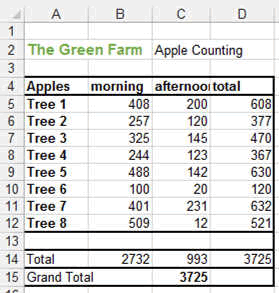
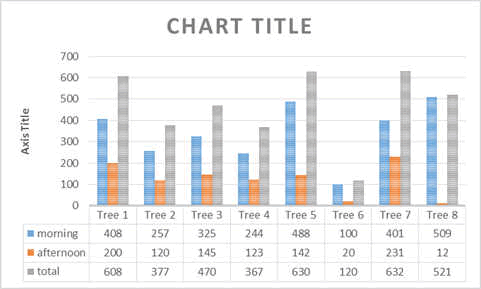
In this example we are back on the farm and we use the number of apples per tree. We would like to see this graphically.
Now lets select what we want to chart.
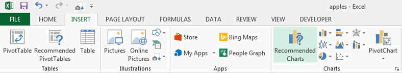
After selecting this, we go into the INSERT Ribbon and press on the RECOMMENDED CHARTS button.
This is the best choice at the beginning except of course if you know what kind of chart you want.... but you would not be reading this, isn't it (;-)
The Recommended Charts Button opens the following window:
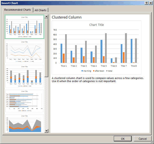
It gives you various sort of graphs or chart that would make sense to chose to display your apple-tree data.
Scroll down and you can see them all. But for the moment, lets select the first one.
IMPORTANT: the most used chart are column charts, pie charts and scatter charts.
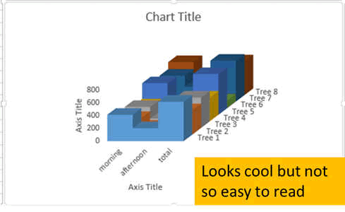
IMPORTANT 2: KEEEEEEPPPP it simple. Avoid 3D graphics, to many features because it takes the attention away from what you want to present.
IMPORTANT 3: Homogeneity is very important. Try not to have too many type of charts.
So we select the first column chart.
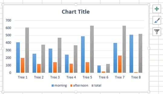
You can see, Excel shows you every tree (1 to 8) and 3 vertical bars showing the morning, afternoon and total number of apples you got.
This is already very nice. For example you can see that the tree 6 had a very low number of apples and therefore it might be sick or dying and needs your attention.
How to change the graph type
This is easily done with the CHART TOOLS' FORMAT Ribbon which give you the choice to change EVERYTHINGGabout this graphic.about this graphic.
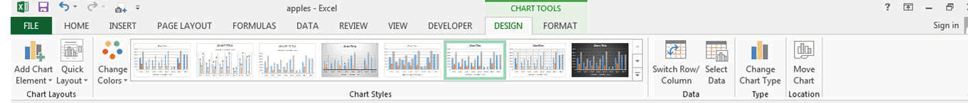
You can change the style, the colors range, the chart type, etc.... basically every thing.
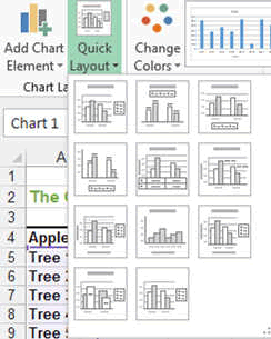
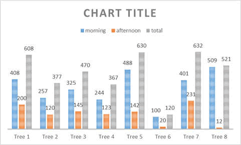
The quick layout allows you to add more information into your chart. Like header, values over the columns, etc... This is extremely USEFUL.
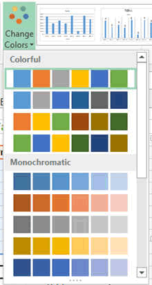
And you can of course easily change the colour scheme with the Change Colour button.
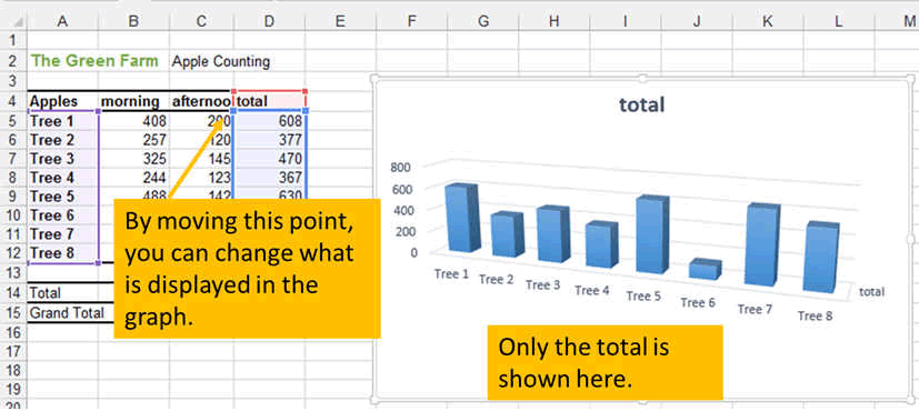
Changing the values displayed
You can easily change what you are displaying by clicking first on the graph and then on the table various areas and moving them (making them bigger or smaller).
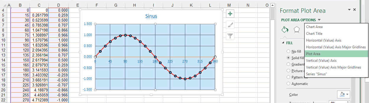
One other example. Sinus waves
Here an example of a sinus wave. For this only this type of chart (Scatter Chart) looks good.
On the right side, you can see all the various parts of the graph that you can change (chart area, title, Horizontal Axis, Vertical Axis, Plot Area, Gridlines, the serie itself).
So that is it for the graphs and charts.
These were only some basics. Now you will learn by doing.