Chart with more than 255 series
If you have a lot of data and want to display it graphically, then Excel
has a limitation that it does not allow to display more than 255 series or
data. The number of data per set is unimportant but you can only display 255
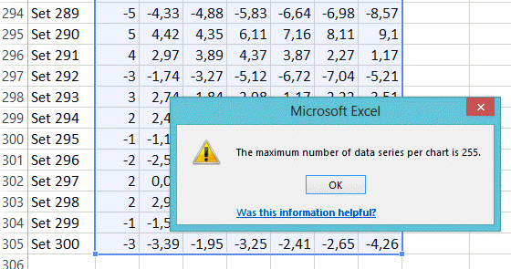
series. So if you have more thant 255 data sets, then the message "The
Maximum number of data series per chart is 255" will appear.
The same is if you want to split one column in multiple smaller ones. Go
to this
link.
So here we are going to show you how to circumvent this :-)
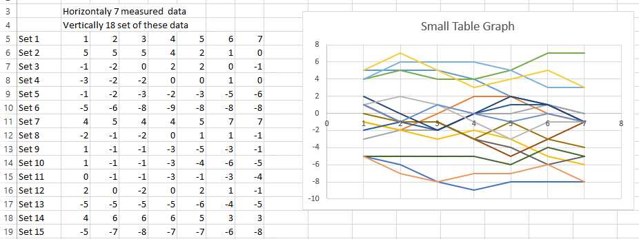
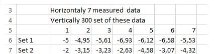
Now suppose you have 300 sets of data and would like to display them this
way.
And you want to have this....
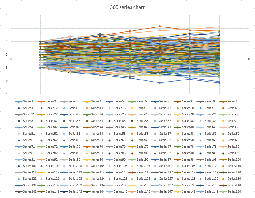
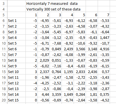
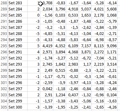
Here is how to split this 7 column very long table with more than 300
sets of data into something that you can then display.
......
If you try to make a table for 300 data sets, you will get the following
error "The Maximum number of data series per chart is 255."
So we will show you a trick how to display these 300 sets. Of course as
every trick or shortcut, there are some side effects.
STEP 1:
Rename (if you can, if you cannot change the formula according to the name
of the sheet where your raw data is) the raw data sheet "rawdata"
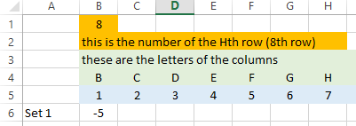
Make sure you to start with your data in row 6, with the headers in row 5.
Rename the headers 1,2,3,4,5,6,7, ...(this is one of the current limitation,
you need to have headers numbered).
It should look like the previous image.
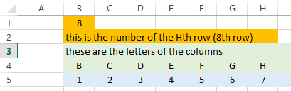
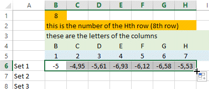
STEP 2:
Create a new sheet. Name is unimportant. This sheet will be for the chart or
graph/plot you will do.
Type the header in Row 4.
In cell B1, type the numbers of columns you have Plus 1 (if you have seven
data per set, then type 8)
In row 4, type the name of the rows that are at the top (B, C, .....,
A1 if you have so many data per sets). Here we have only 7 data per set.
In row 5, rename the data headers like you did in the RAWDATA sheet. You can
also copy paste it from there.
It should look like bellow.
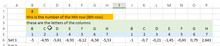
STEP 3:
Copy the following formula in the cell B6.
=INDIRECT(CONCATENATE("'rawdata'!";C$4;ROW()+250*(INT(COLUMN()/$B$1-0,1))))
This should be the first cell of your data also in the RAWDATA sheet.
After pressing ENTER, you should see appear the data of cell B6 of your
sheet RAWDATA
Note: this formula use four important functions of Excel that you can find
the explanation on our site too.
Indirect,
concatenate,
row,
column
STEP 4:
Now pull the cell to the right.
STEP 5:
Now select range B4 to H6. Press Ctrl-C or Copy the cells.
Paste the cells in the cell J4 (or 2 cells after the last data of your set).
It should look like this.
And now pull the range A6 to P6 down until you reach data set 250.
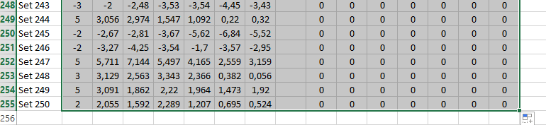
If you see 0 (zeroes) on the right columns then this means that all your
data has been now converted in two columns (you had less than 500 data set).
You can go to the step 6.
If you have more than 500 data sets, you will have to create a third (3rd)
set of columns as per step 4.
STEP 6: Let make the chart
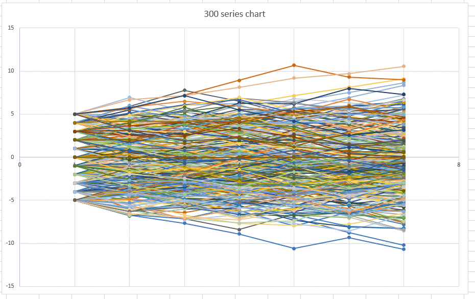
Select the range of cells from B5 to P255.
Insert a scatter chart with markers or without and you will get something
like this.
Of course you will delete the data legend because it is just useless
here to get a perfectly nice chart with more than 255 data series per chart.
We hope this example was useful. Please tweet, like or share.
Download the template from
here.
Please Tweet, Like or Share us if you enjoyed.